WCAG 2.2 was scheduled to be approved in November 2020, but this year being what it has been, it will not be approved until next Summer 2021. That said, it is likely to be adopted in its current form, so it is worth reviewing to see what will change.
New WCAG (Web Content Accessibility Guidelines) updates make Marketers and Web Administrators nervous and I typically hear questions like:
- What if we are doing something wrong and need to change a bunch of stuff?
- What do the rules really mean?
- How do I know if I am complying or not?
- Where am I going to find the budget for this?
Luckily for everyone, the WCAG 2.2 AA updates are common sense additions that comprise a baseline acceptable user experience for any web user. I would propose that anyone reading this article is more than capable of passing judgment on compliance with the 2.2 updates. Let’s look and you can see what I mean.
I have divided the 8 new success criteria into 3 sections:
- Does This Really Need to Be Said?
- Things Everyone Hates.
- Yes, That Makes Sense.
A note on scope: This is a simplified summary of the new success criteria that is sufficient for 90% of use cases. For more info, specifics, and detailed exceptions and alternatives, click on the Success Criteria name to be taken to WCAGs pages.
Does This Really Need to Be Said?
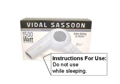
To me, these are like “Do not use hairdryer while sleeping” warnings…you should not have to say it, but you do.
2.4.11: Focus Appearance (Minimum)
OR...I need to be able to see your “visible focus indicator.”
The doc provides guidelines for separate ways to be compliant and some weird edge cases, but visible focus should be visible.
2.5.8: Pointer Target Spacing
OR...Make it easy for me to tap things you want me to tap.
If your buttons or menus are too close together, they are hard to activate, especially when using a touch screen. WCAG specifies that items need to be at least 44x44 pixels, including surrounding spacing. This size approximates the size of a fingertip on a screen and codifies what has been a best practice in mobile design since the iPhone was introduced in 2007.
Notable Exception: this does not apply to links inside text, just menus, buttons, etc.
3.2.6: Findable Help
OR...If you offer a help feature, I should be able to find it.
Access to your help feature should be in a consistent place.
3.2.7: Hidden Controls
OR...Do not hide controls if you want me to use them.
You should not hide controls provided for people to use. They should always be visible so people know they are available or have an option where they can have them “always on.”
As an example of this, I have seen several content applications where a little pencil icon, shown when hovering over some text, is the only indication that that text is editable. I cannot tell you the number of times I have heard “Well how was I supposed to know that?!” in response to one of these interfaces.
Things Everyone Hates
And yes, I hate these too.
3.3.7: Accessible Authentication
OR...CAPTCHAs are horrible.
Basically, allow people to bypass “I am a human” tests for logging in by using some alternative method of authentication (multi-factor, OAuth, hardware token, device based facial-scan, fingerprint, pin code).
Personally, I do not have any disabilities and it often takes me several times to pass those “blurred and twisted characters” CAPTCHAs.
3.3.8: Redundant Entry
OR...Do not make me repeat myself.
When filling out a form or making an order, do not make people enter the same info twice in the same session.
An example of this is those wonderful “shipping address is same as billing address” checkboxes, or when your account number is prefilled from the previous page of a form.
Yes, That Makes Sense
These cases do not come up as often, but when they do, they can be smooth experiences or enormous obstacles.
2.4.13: Fixed Reference Points
OR, my book and my eBook should have the same page numbers.
If you publish electronic and printed versions of materials (like books, textbooks, etc.) you need to be able to match them up between mediums. So, if someone says, “In the third paragraph on page 73 Sal Paradise…” everyone in the conversation can be “on the same page.”
If this applies to you, the text of the guidelines provides a lot of useful guidance.
2.5.7: Dragging
OR...Dragging is hard.
Unless essential, operations performed by dragging should also be performable by a single pointer without dragging. Other options could include multiple clicks, using menus, keyboard input, arrow keys, etc.
Some folks may not be able to drag, and other times it may be difficult. Personally, I find the “click and drag” operation can be difficult on a trackpad and I just give up on some operations.


