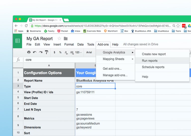
Google Analytics is a valuable marketing tool and provides great reports, but I don’t know a single analyst who doesn’t spend a good chunk of time consolidating multiple GA reports into spreadsheets, presentations and pivot tables. Today, I’ll let you in on a secret that has saved me countless hours: Google has provided a free tool to do exactly this, completely automatically.
The tool is a Google Sheets add-on. It’s super-easy to use, and extremely powerful. Here’s how to get started with it:
Installing the Analytics Add-On
First, open a new Google spreadsheet (https://sheets.google.com/).

Next, you’ll want to install the add-on by clicking “Get Add On” in the Add-Ons menu. This will bring up a browser, which will allow you to search for ‘Google Analytics’ and add it to your account.
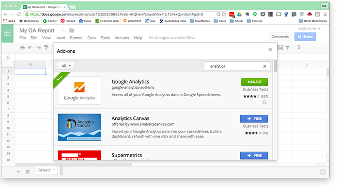
Create your first report
Once you’ve installed the add-on, you’ll see a “Google Analytics” option in your "Add-ons" menu. To create a report, just select "Create new report” from this menu.
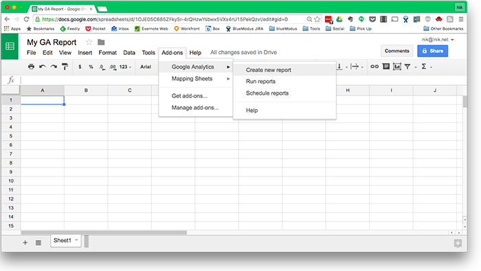
If you already know your way around the features of Google Analytics, the report builder should be very straightforward tool. Simply name your report, select the account, property and view you want to report on, then enter your desired metrics and dimensions.

This will bring up a new tab to configure your report. If you don’t like any portions of the default settings, you can change them as you see fit. (For example, I usually end up changing the “Last N Days” cell to more than a week, which is the default.)
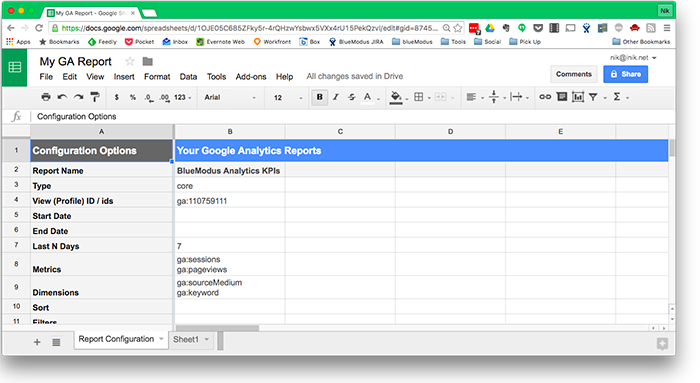
Once configured, run the report from the Google Analytics add-on.

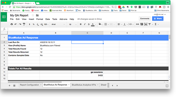
In just a couple seconds, your sheet will have a new tab with the report’s name as its title, containing the dimensions and metrics you requested, as well as a summary of results. How easy is that?

Setting up multiple reports
If you want to summarize multiple reports, simply go back to your configuration tab, enter the report builder, and create some new metrics. Maybe in addition to KPIs, you want to track ad response?
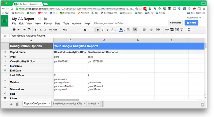
Once you’ve set up additional reports, select “Run Reports” again. For each report, a new worksheet tab is created with the corresponding summary data.
Going Further
I’ve already found numerous advantages to using this add-on. For example:
- Unlike GA reports, these spreadsheets can be edited and styled to your liking. Even if you run a report multiple times, your style changes will persist, so go ahead and put in your favorite fonts.
- You can also “publish” charts created in Sheets to a Slides presentation and have them automatically update…why not put your weekly status meeting presentation on autopilot?
- Whenever a report is re-run, it will overwrite the content in the associated tab, so you can create new worksheets that summarize or pivot the data created by these reports (just make sure your selection ranges take into account the fact that the length of the report will vary).
- You can also go back to the report configuration screen and add your own dimensions, filtering rules, and other criteria to refine your reports even further. For the variables to use, you can refer to Google’s documentation on the Analytics API.
- And if you’re more comfortable in Excel, you can even export Sheets as Excel files.typei
Find Google Analytics tips like this useful? Let me know how you’re using it for your business, and what other topics you’d like me to cover!


